
new F1 branding
by robin awanI’ve played Playstation since the mid ‘90s, when it was released, and back then there was a super cool game that everyone played. Wipeout was set in the future and The Designer Republic (the crazy kids behind its branding) made it look like it was from another time, the future. And with the game still alive today the brand lives on and is still yet to go out of date! Every visual was considered, from the logo and the box art to the HUD graphics – it even had its own typeface. Take a look.
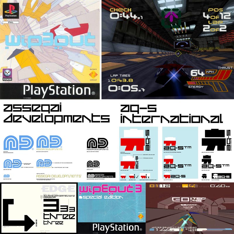
It wasn’t just the master brand that was awesome, but the whole concept throughout the game. With racing teams having their own brands that accompanied the master brand as this futuristic, super fast, high octane sport. Talking of which brings me to Formula 1. And with the F1 in town this weekend, it’s a good time to look at their new branding too. The new branding is great, don’t get me wrong, it is sporty and bold. The new logo is a bold brand stamp, and in comparison to the old one is incredibly powerful with its sleek lines and steeper italic slant. The brand comes with a new font too. It reminds me of race tracks with its sweeping curves and tight bends. I’m sure this is the look they wanted, and it really suits the brand. What’s more it feels like its from the future, much like the machines they now drive. Packed with mind boggling technology and scientifically crafted fins that carve through the air, they are more spaceships than cars.
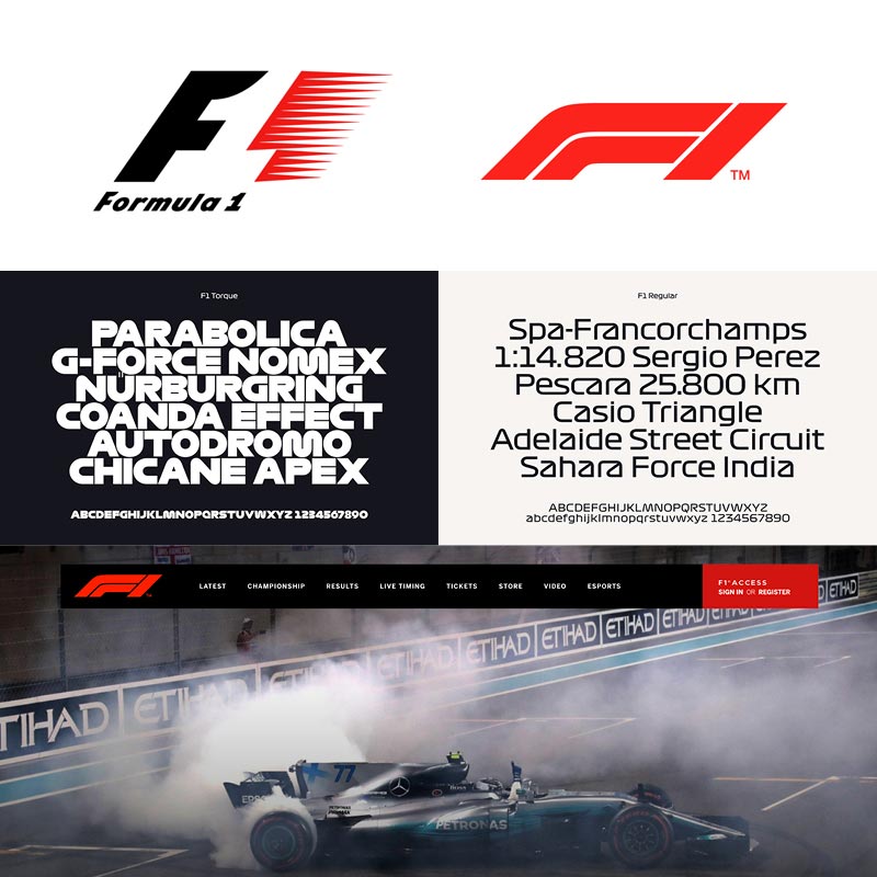
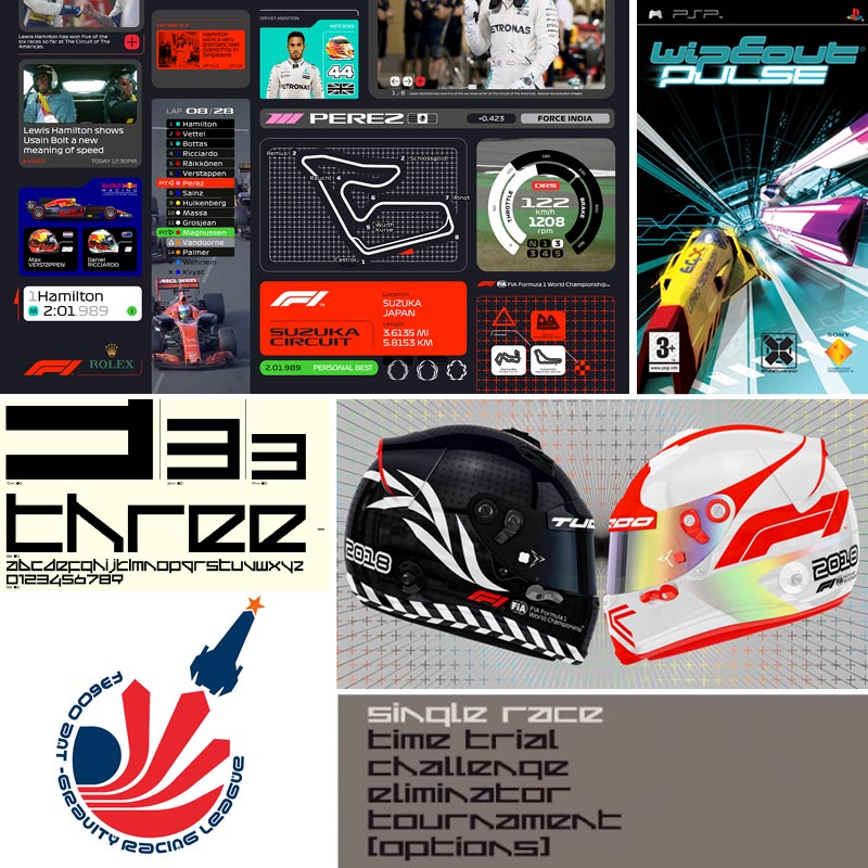
So the new futuristic look and the sleek fin adorned cars are all very nice, but to me it feels somewhat familiar. To me it’s like Wipeout (that game from the mid 90s), but in real life. I’m not saying it’s a direct rip off, but I do feel there are a lot of similarities. And I love it. It’s nice to romanticise over the idea that I can now watch something for real that is as close as we can get to Wipeout – and what isn’t inspiring about the Wipeout brand anyway?! It’s like the future was finally there – in the 90s! Take a look at the brands in comparison. It speaks for itself.
As close as they appear to be, one thing is for sure. The F1 brand is looking faster than ever and I can’t wait to see it in full flight!


