visual diary 2
by brigitte charronwww.kinfolk.com
The magazine and the website are amazing. Both are well designed and the content is always interesting. It has beautiful photography.
Barbie ‘Imagine the possibilities’
Hidden cameras capture real reactions to girls imagining everything they might one day become. This ad communicates in a fun, clever, uplifting way that the Barbie brand represents the fact that women have choices – by showing little girls acting as teachers and doctors and businesswomen in real-world environments.
Rekorderlig Cider ‘Silver skaters’
It’s quirky and funny. The moves are pretty cool too!
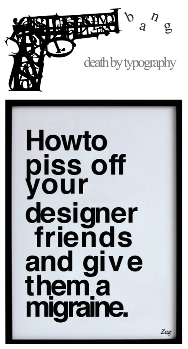
Typography: kerning and letter spacing
These two are essential for effective visual communication. It something I do automatically when working with text. It’s my number one dislike when I see text badly kerned (in second place would be drop shadows).
Kerning is the process of adjusting the spacing between characters in a proportional font, usually to achieve a visually pleasing result. tracking refers to a consistent degree of increase (or sometimes decrease) of space between letters to affect density in a line or block of text.
Letter spacing adjusts the spacing between all the glyphs in a piece of text. This can help to make a page look a little more open and inviting, for example, especially with a similarly open leading. Very large type, such as a big headline, almost always benefits from tightening the tracking. Tiny type, such as in captions or footnotes, is made more readable by opening the letter spacing a bit, especially if the paper is absorbent and will allow the ink to spread a little.
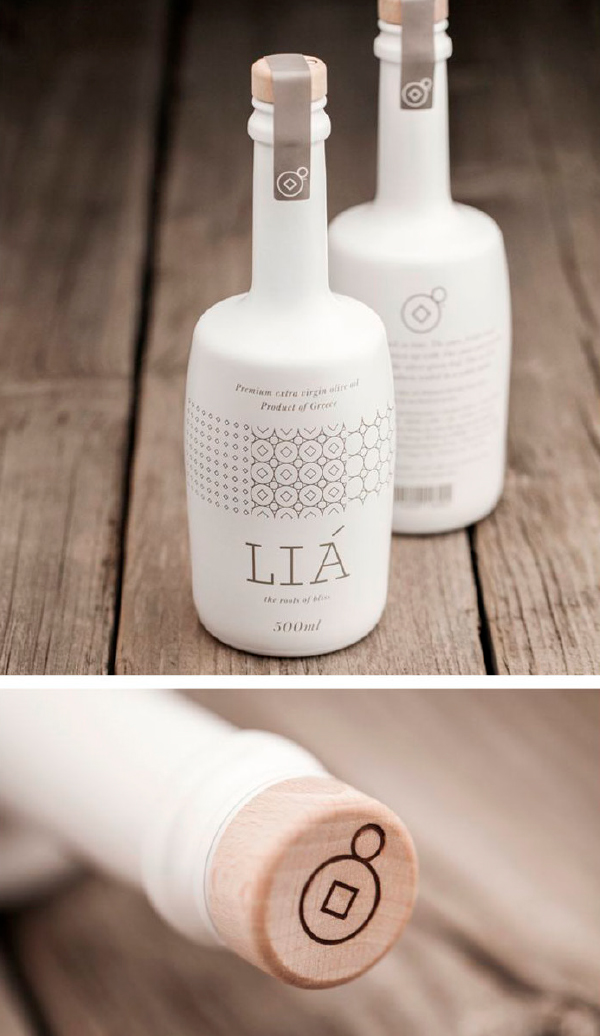
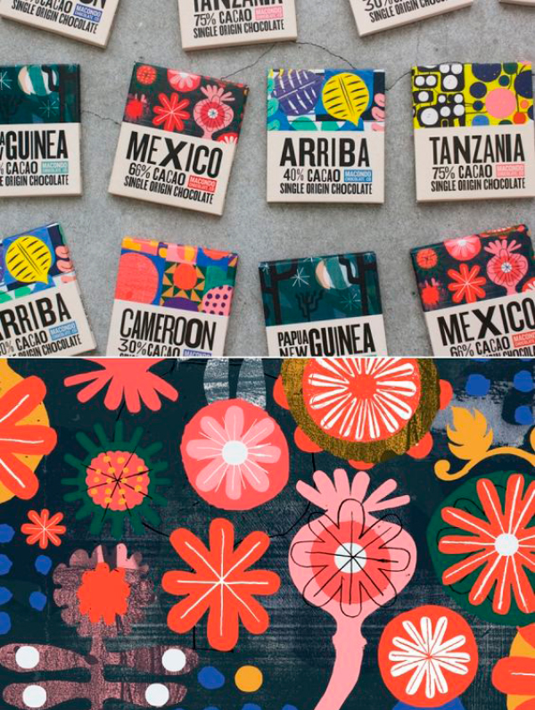
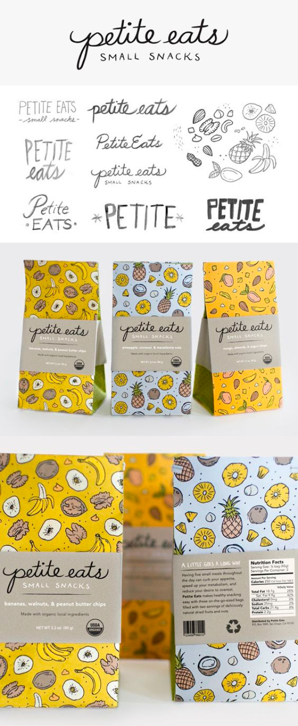
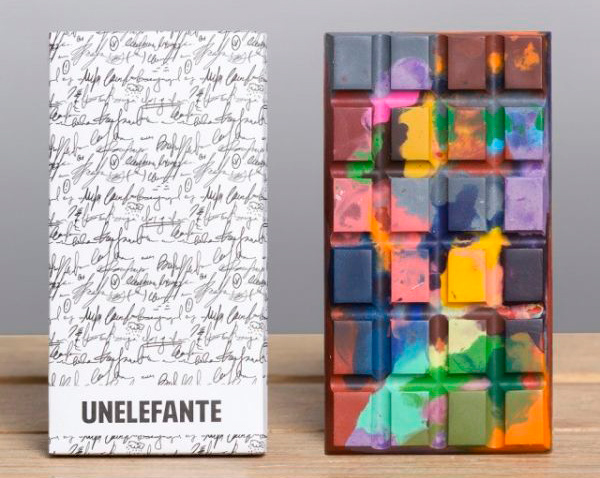
A few pins from my packaging board